Improving the library search experience for students
Many AUAS (Amsterdam University of Applied Sciences) students struggle to find relevant sources on the library website.
- Task completion
- 6/7
- Search efficiency
- 2x
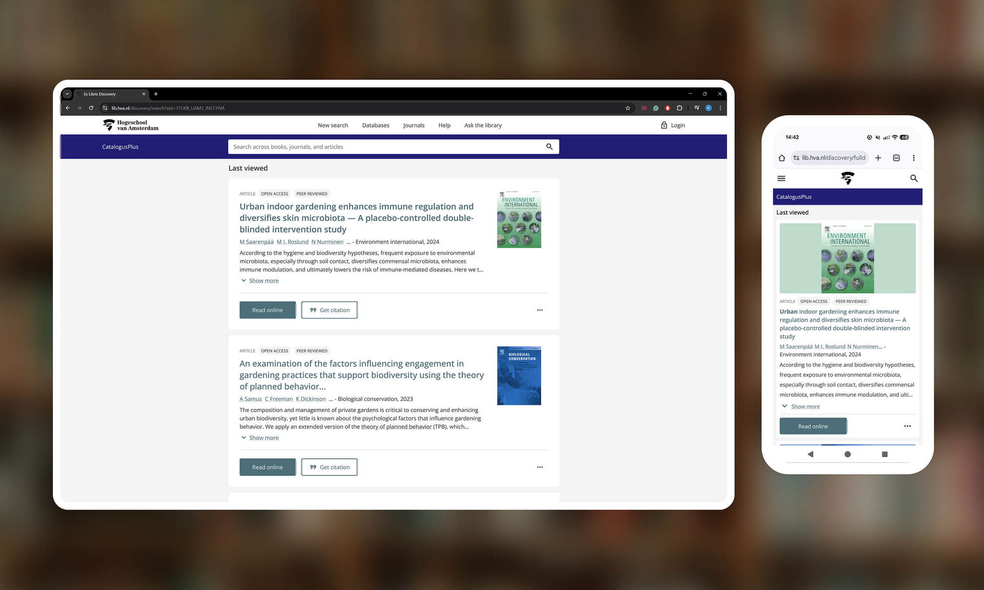
Role UX designer Time 3 months Prototype Figma prototype
1.0 Discover
1.1 Research methods
To gain a clear understanding of customer needs, bottlenecks, and business objectives, I combined multiple research methods. This allowed me to gather both qualitative and quantitative insights from different perspectives.
- Survey (S): We distributed five questionnaires to graduating students to understand their pain points and motivations.
- Interview (I): I interviewed a student to gain more in-depth insight.
- Competitive Analysis (CA): Comparison with other libraries at other schools to gain inspiration and discover possible solutions.
2.0 Define
2.1 Design challenge
How could we help students find relevant sources for their research?
2.2 Persona
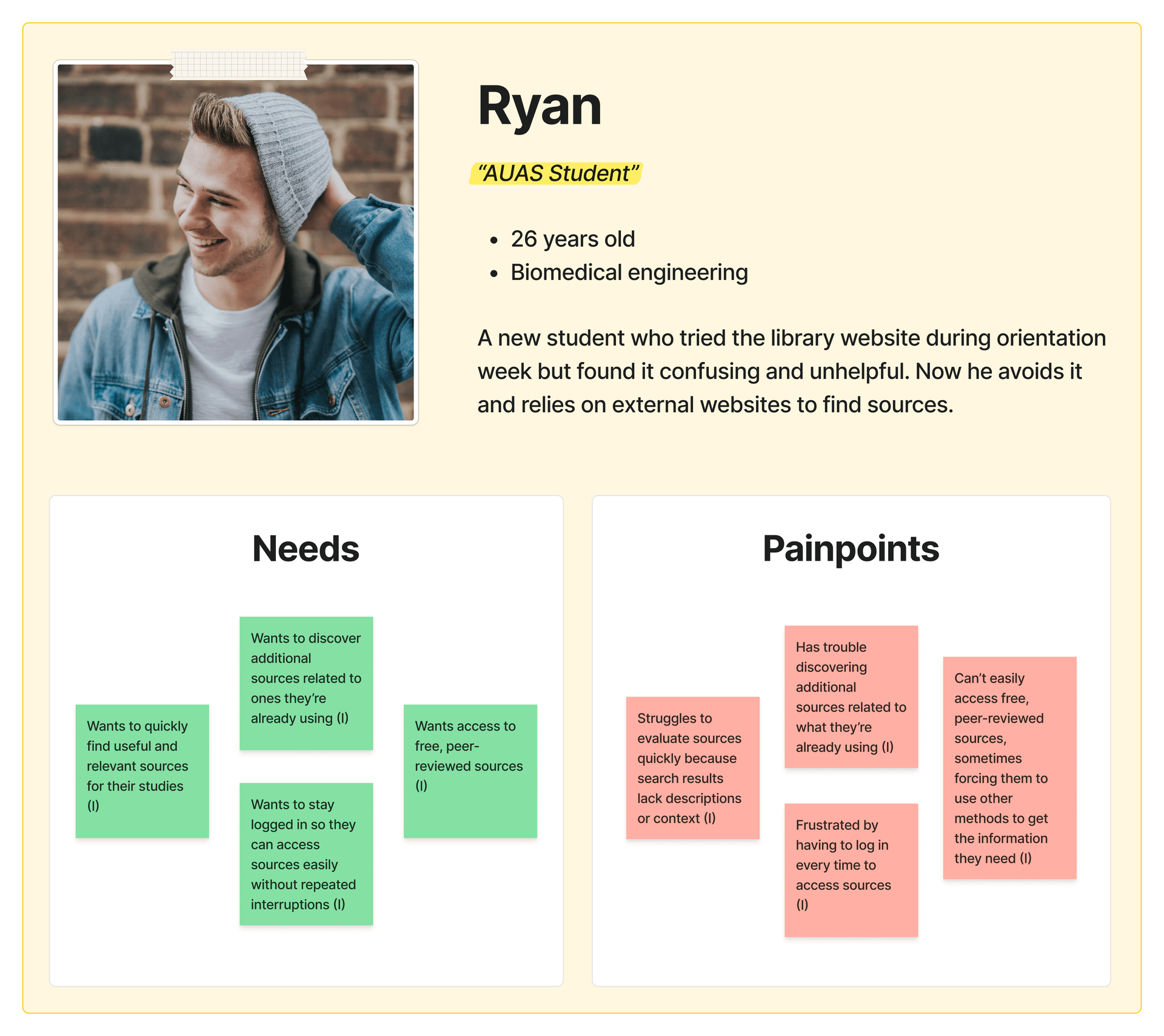
This persona represents a new student navigating the AUAS library website. He finds the interface cluttered and the search confusing, making it time-consuming to find and evaluate sources. As a result, he often avoids the library, relying on external platforms that handle these tasks more efficiently (see 3.4 Competitive Analysis).
2.3 Customer journey map
The customer journey map shows a student’s experience using the AUAS library website during orientation week, highlighting key pain points in finding relevant sources.
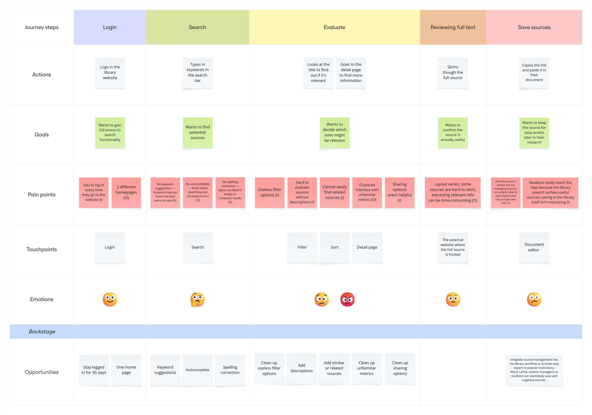
I identified the main problems that hinder students from efficiently finding, evaluating, or using library resources. The most important issues are described below, along with their impact on the user experience.
2.3.1 Limited search information
Phase: Evaluate
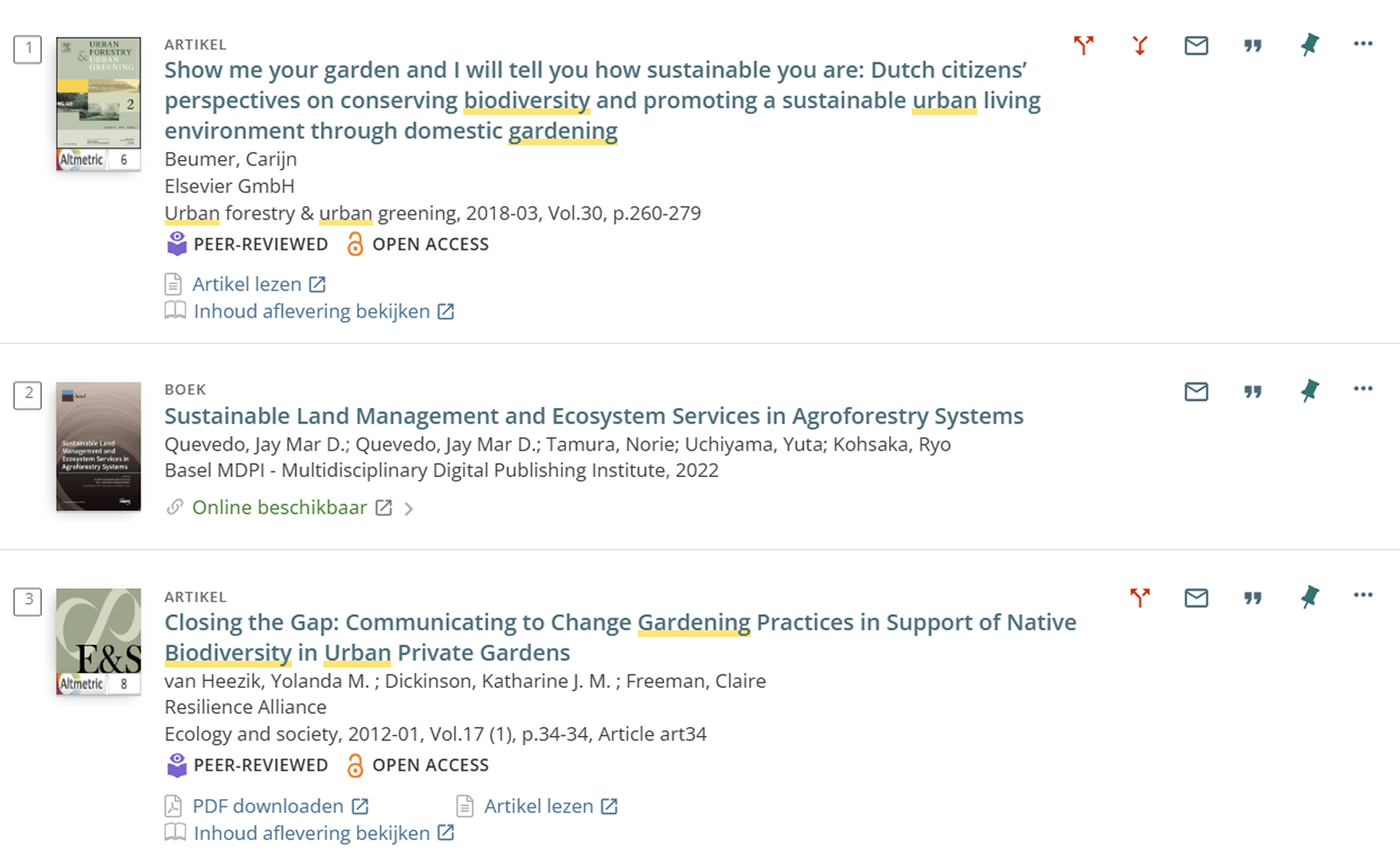
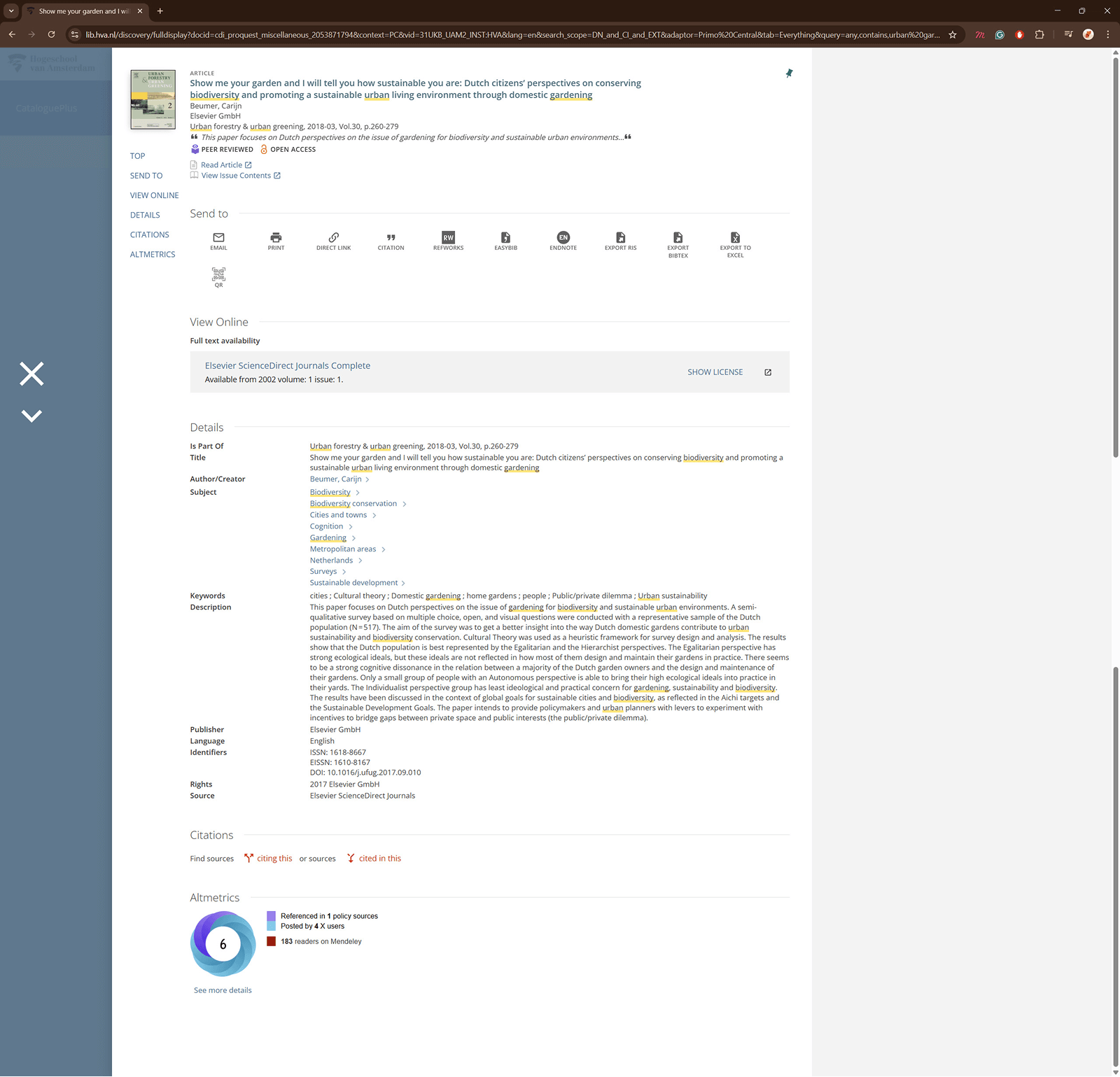
Problem: Search result items only display titles and citation metadata, providing insufficient context (I). Without abstracts or keyword highlights, students must open each result and scan the item page to judge relevance.
Impact: Increases the number of steps and time required to find relevant sources; students may miss useful items or rely on platforms with richer previews.
2.3.2 No contextual suggestions with search results
Phase: Evaluate
Problem: The website offers no recommendations or related sources in the results (O). Students must run multiple searches to find relevant information.
Impact: Most users only view the first three results, so missing contextual suggestions lowers efficiency. Research shows recommendations improve relevance ranking (from 4.5 to 3.0) and nearly double click-through rates (Carevic et al., 2018).
2.3.3 Distracting layout and filters
Phase: All phases
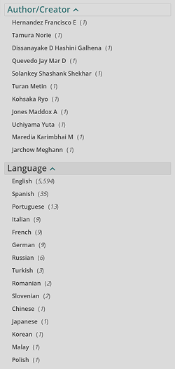
Problem: Result items and filter panels include unnecessary metrics that distract from evaluating sources (O).
Impact: Students may feel overwhelmed or overlook relevant results, slowing down their search process.
2.3.4 Ineffective exporting options
Phase: Save source
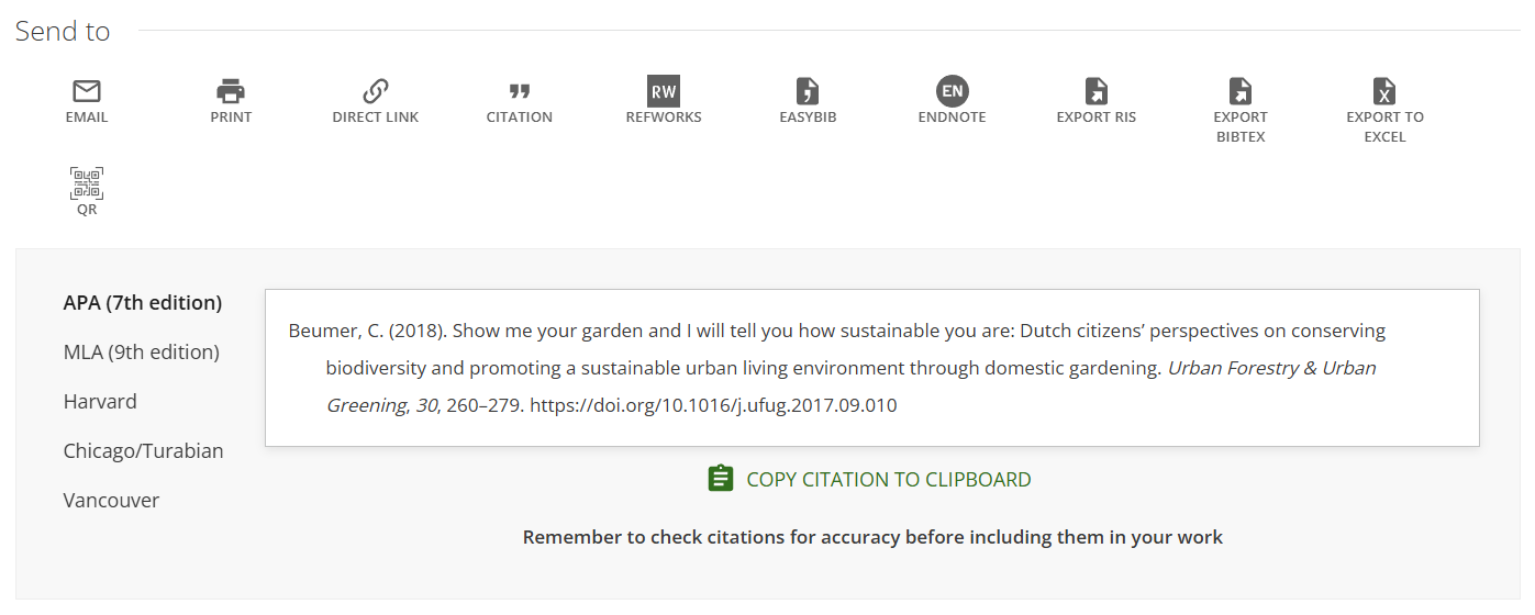
Problem: Sharing options are confusing and rarely used (I). Features like QR codes, Excel exports, and unfamiliar citation managers add clutter, while only citation support is consistently useful.
Impact: Students may ignore the options, waste time, or feel frustrated, leaving sharing needs unsupported.
2.3.5 Poor mobile experience
Phase: All phases
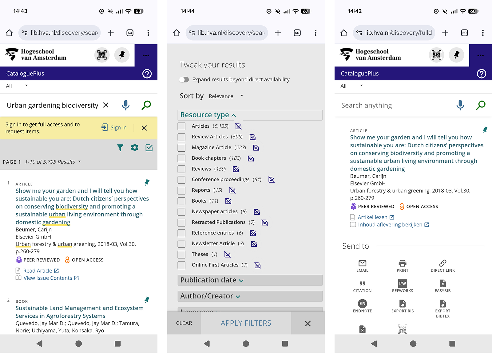
Problem: The mobile layout is responsive, but it still feels cluttered. The navigation isn’t very clear, and using search results and filters on a small screen can be frustrating.
Impact: Students have a harder time finding and evaluating sources, which can make them less likely to use the library resources on their phones.
2.4 Competitive analysis
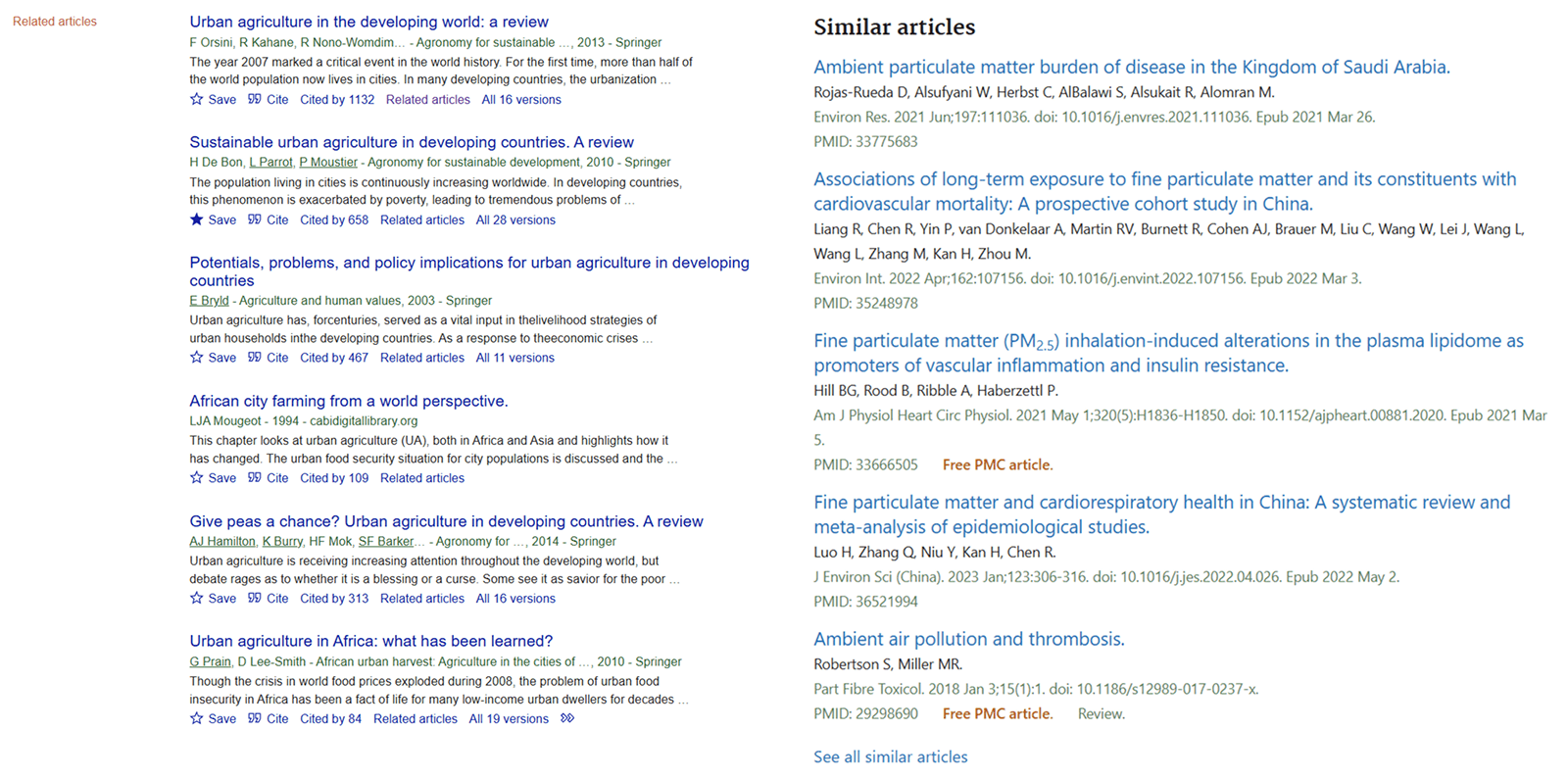
To compare how students find and use sources, I analyzed Google Scholar and PubMed. The focus was on three tasks: evaluating sources, discovering related content, and saving or sharing sources.
2.4.1 Evaluating sources
Google Scholar shows minimalistic citations in a single line with keyword-highlighted snippets, making relevance easy to judge. PubMed displays full citations with all authors and highlights keywords only in the abstract, taking up more space. The concise snippet approach of Google Scholar appears more effective for quick evaluation.

2.4.2 Discover related content
Google Scholar links to related articles on a separate page, but the connection isn’t always clear. PubMed lists similar articles at the end of the detail page with direct navigation, providing better context and a smoother exploration experience.
2.4.3 Save or share sources
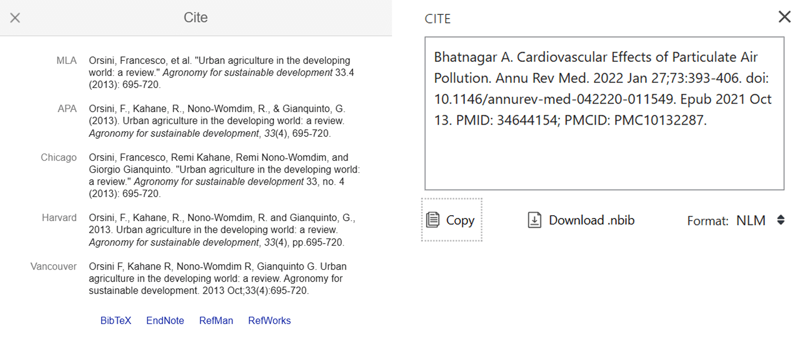
Both websites allow users to save sources and generate citations. Google Scholar clearly lists multiple citation formats (Fig. 14), while PubMed shows only one style by default and hides other options, making it harder to use (Fig. 15). Providing clear and accessible citation options supports a more efficient research workflow.
2.5 MoSCoW
Below, I have listed requirements that give me direction and make it easier to make choices for my product.
Must
- The user can find and evaluate relevant, useful sources efficiently.
- The product complies with WCAG 2.1 accessibility standards.
Should
- The user can provide feedback on the usability or relevance of a resource.
Could
- The user receives personalized suggestions.
3.0 Develop
3.1 Morphological chart
This method breaks down key user tasks and lists multiple solution ideas for each. It helped me explore design options in an organized way and find the most promising directions for the redesign.

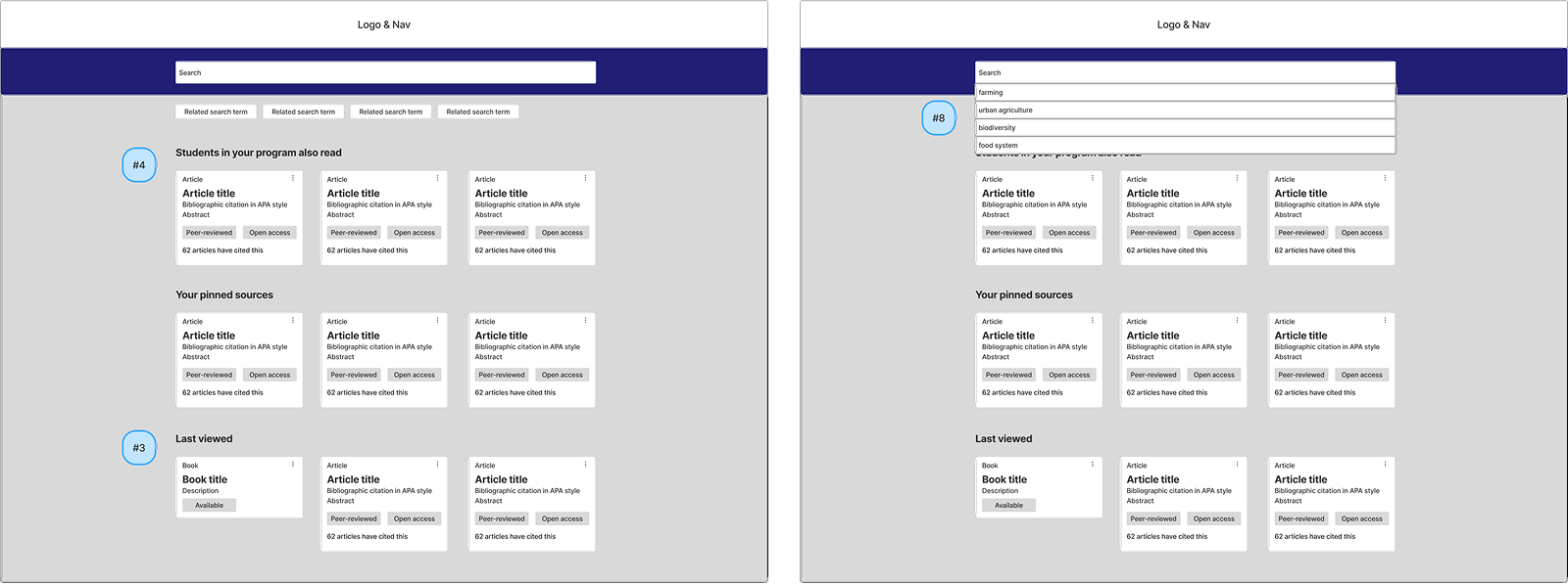
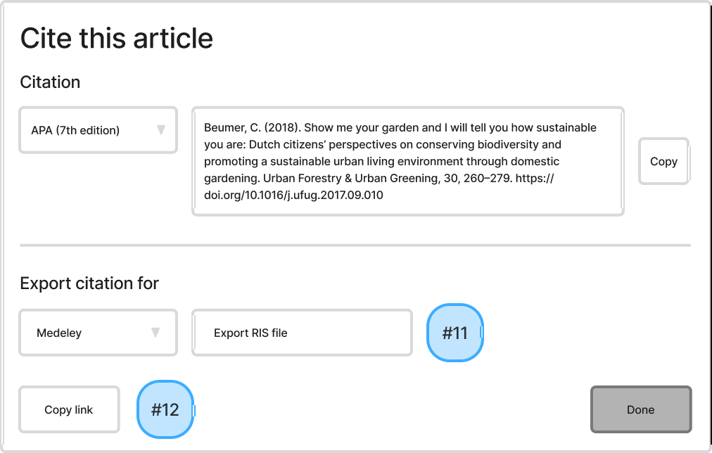
Each solution in the chart is numbered, and the corresponding numbers are shown in the sketches below for clarity.
-
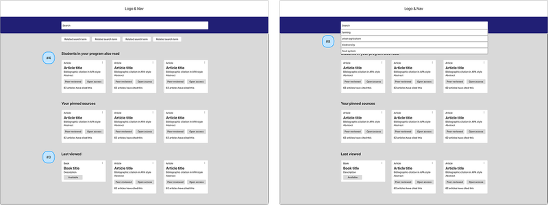
Fig. 12 Home page (left) Search (right) -
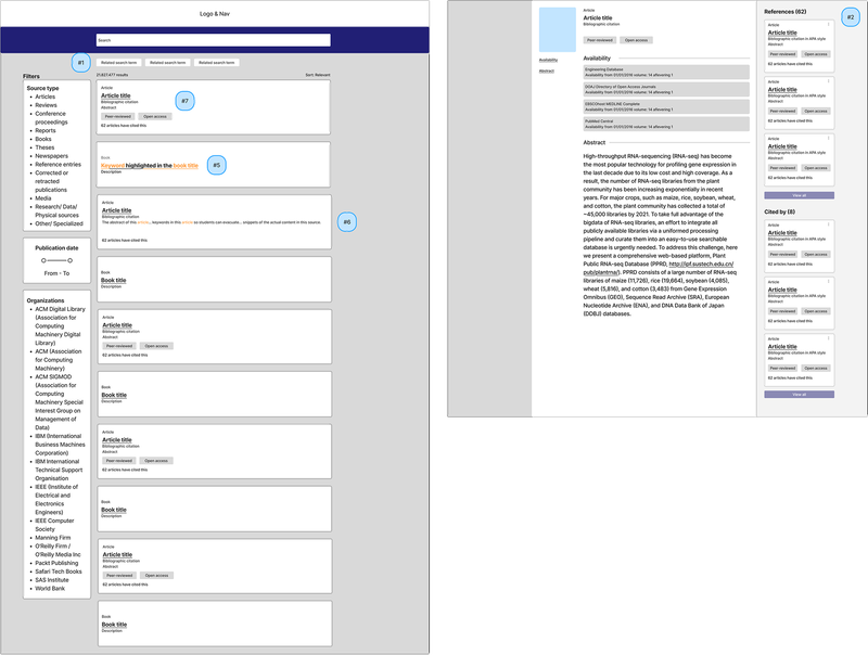
Fig. 11 Result page (left) Detail page (right) -
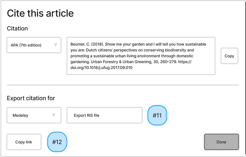
Fig. 13 Citation LoFi wireframe

3.2 Impact/effort matrix
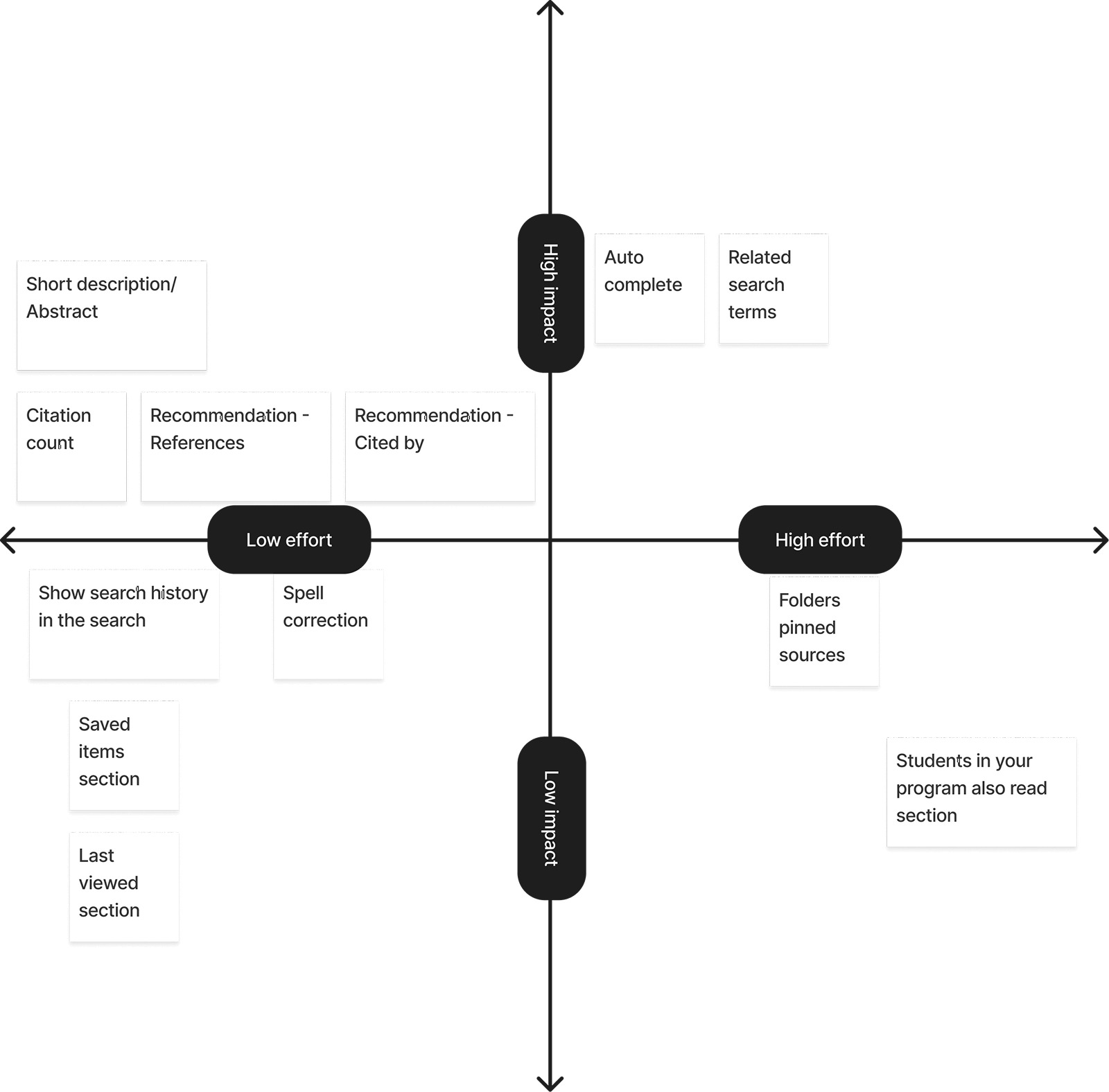
Together with Zoglo - Core Developer Contao CMS, we mapped out the ideas in an impact/effort matrix to determine which ideas to implement. I decided to only design ideas that are high impact & low effort and low impact & low effort (left side).
3.3 Usability testing
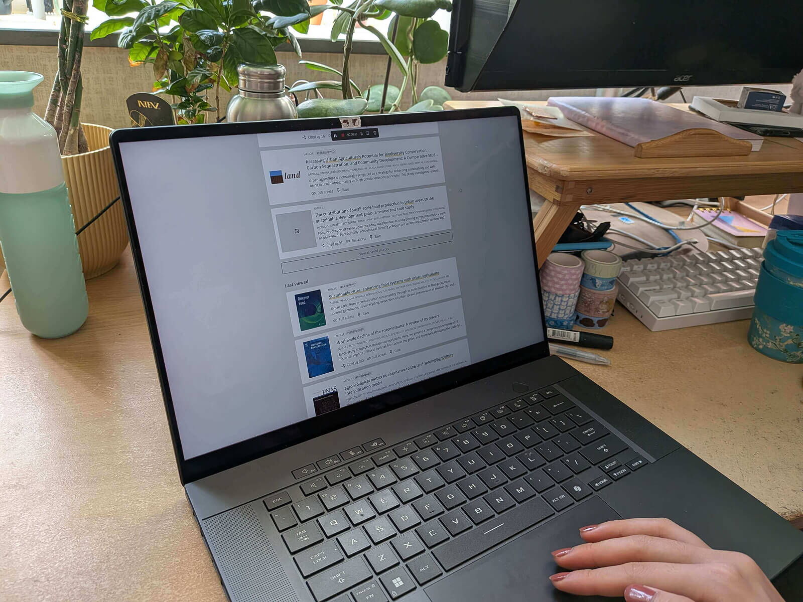
I conducted seven usability tests. Participants had varied backgrounds, including students, a recent graduate, and professionals.
4.0 Deliver
4.1 Final design
In this redesign, I improved the usability and key interactions while keeping the overall look consistent with the current library website. This way, the design still feels familiar to users, but the main issues found in testing are solved.
4.1.1 Limited source of information
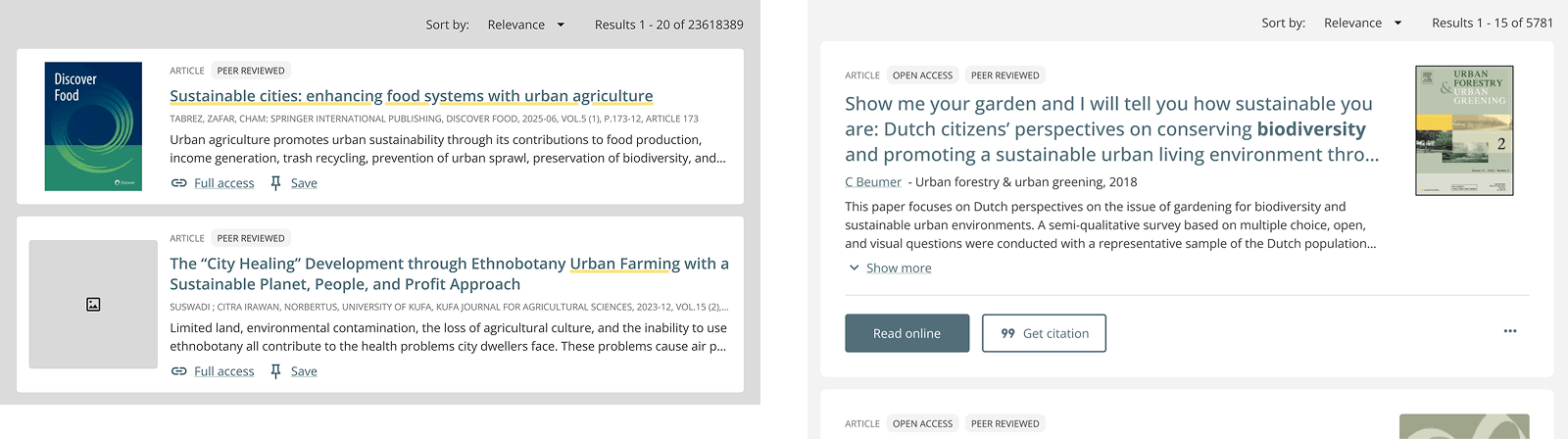
Problem: Titles alone make it hard for students to judge relevance.
Initial design: Abstracts were initially truncated to two lines. Usability tests showed students still had to click into the detail page too often (Fig. 23).
Refined design: Full abstracts are displayed inline with a ‘Show more’ link, allowing students to quickly evaluate relevance without navigating away from the results page (Fig. 24).
4.1.2 Contextual suggestions
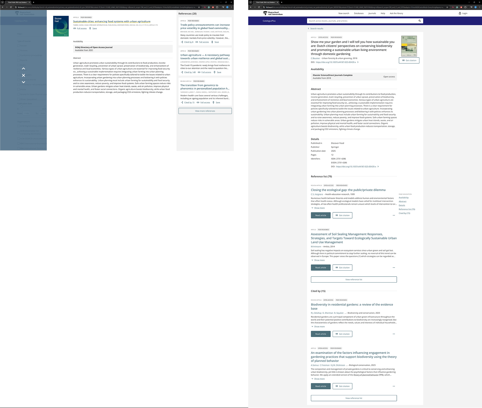
Problem: The website provides no related sources, forcing students to perform multiple searches.
Initial design: ‘Cited by’ and ‘References’ were initially on the right side of the page. Tests revealed that they were distracted from the abstract, the most important element.
Final design: Contextual suggestions, including ‘Cited by,’ and ‘References,’ are displayed below the abstract, keeping focus on the source while offering easy access to related content.
4.1.3 Distracting layout and filters
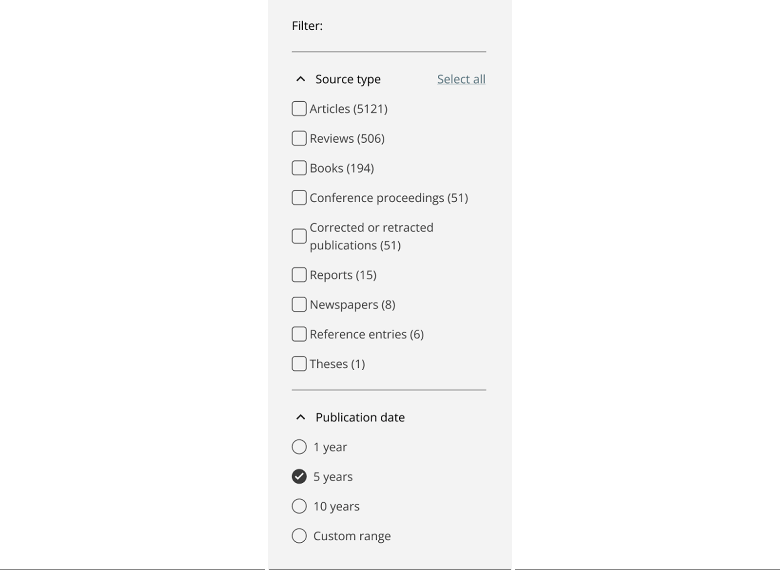
Problem: Cluttered filters and unnecessary metrics distract users from evaluating sources. The original filters included hidden “exclude” options, which confused users.
Final design: Filters are simplified and organized, combining similar types and keeping only necessary categories. Unused metrics are removed, and only relevant sharing options remain. This creates a cleaner, more focused layout.
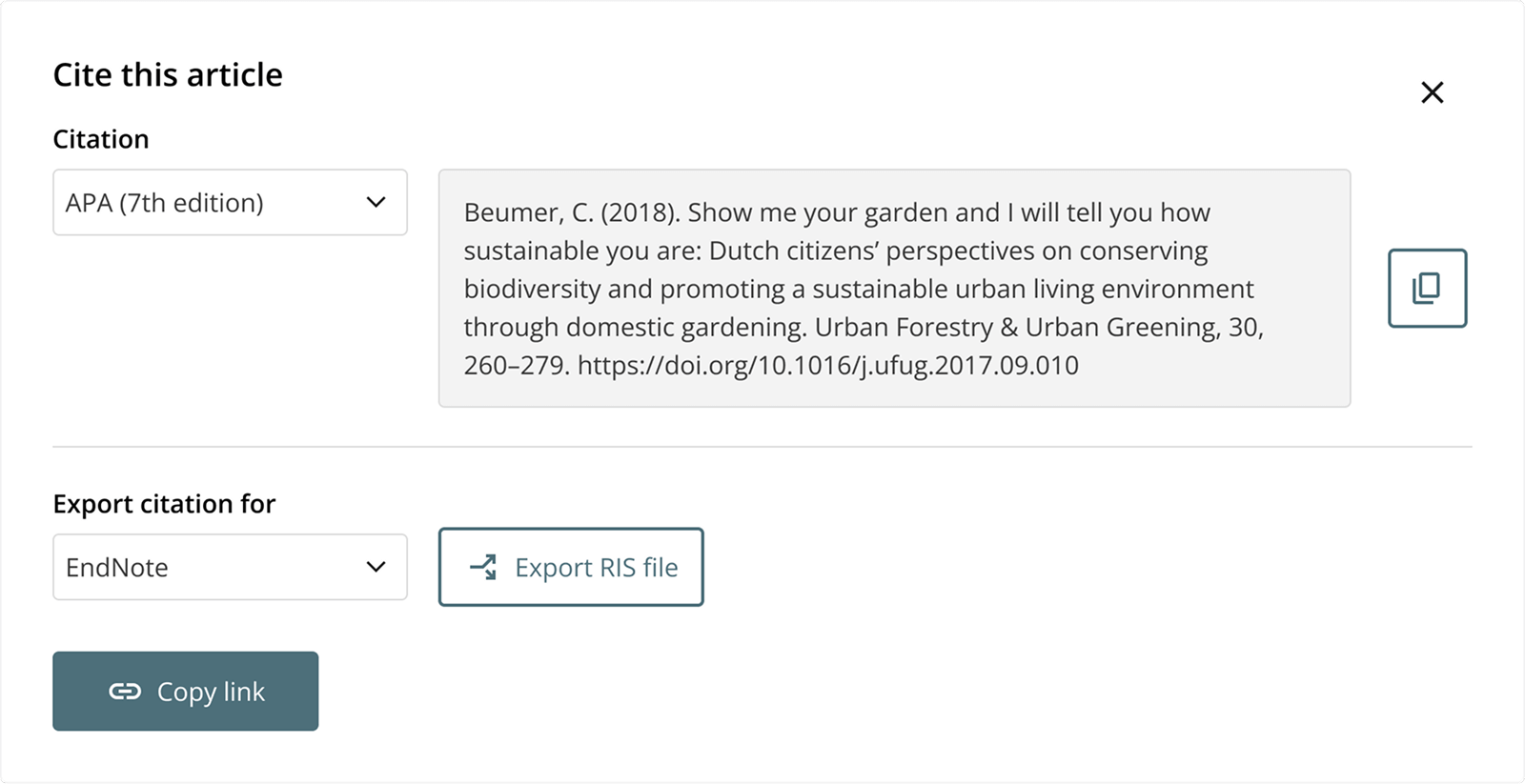
4.1.4 Streamlined citation export
Problem: Sharing options are confusing and unused, and citation options are buried.
Final design: Users can now choose their preferred citation manager or LaTeX editor, with file formats (RIS or BibTeX) clearly labeled. This streamlined approach reduces confusion and supports their workflow efficiently.
4.1.5 Responsive design
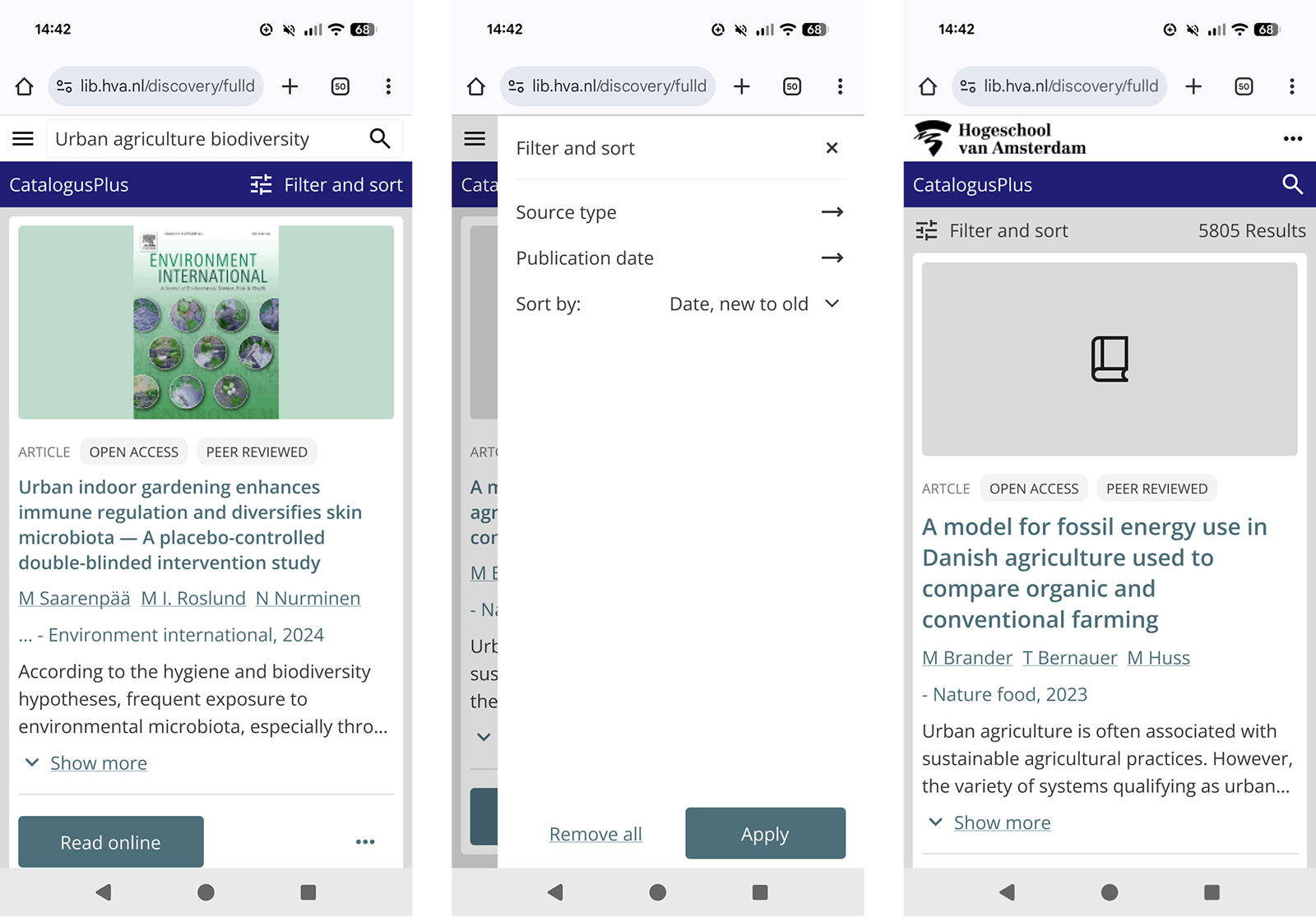
Problem: On smaller screens, the layout is crowded, hierarchy is unclear, and navigation, results, and filters are hard to use.
Final design: The mobile layout now has clear spacing and hierarchy. Titles, results, and filters are readable, usable, and visually consistent across devices.
4.2 Reflection
4.3 Reference list
https://doi.org/10.1145/3197026.3197054